|
|
Post by walkon on Aug 30, 2022 16:22:16 GMT -5
|
|
odog
Mop-Up Time
 
Posts: 102
Likes: 23
|
Post by odog on Aug 30, 2022 21:18:28 GMT -5
Am I the only one who’s not into the L logo? It’s just absurdly large in almost all uses and makes everything seem off-center.
I was happy when it was coming back, but have never been enamored with the final product.
Still exciting to have a crack at the Adidas stuff 😊
|
|
|
|
Post by walkon on Aug 31, 2022 7:16:04 GMT -5
Am I the only one who’s not into the L logo? It’s just absurdly large in almost all uses and makes everything seem off-center. I was happy when it was coming back, but have never been enamored with the final product. Still exciting to have a crack at the Adidas stuff 😊 Better than the most recent explorers logo! I want them to bring back the previous explorer logo, before the one introduced in 2003 or so. |
|
|
|
Post by JoeFedorowicz on Aug 31, 2022 7:47:23 GMT -5
 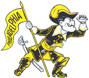 Should lean into this one and move to a person as the mascot and not the costume. I'd change the PHILADELPHIA on the banner to "BROAD/OLNEY" or "NORTH PHILLY" tho. |
|
|
|
Post by explorerman on Aug 31, 2022 8:18:59 GMT -5
Am I the only one who’s not into the L logo? It’s just absurdly large in almost all uses and makes everything seem off-center. I was happy when it was coming back, but have never been enamored with the final product. Still exciting to have a crack at the Adidas stuff 😊 Yeah I am with you. I actually didn’t understand the move and when or why it was made. You can always quibble on logos but I thought the explorer logo from the last decade and change was completely fine and more consistent with it today’s Division 1 school logos. This logo is like an Ivy League or high-end D3 school that just uses the letter because they can |
|
|
|
Post by golasalle on Aug 31, 2022 8:55:58 GMT -5
  Should lean into this one and move to a person as the mascot and not the costume. I'd change the PHILADELPHIA on the banner to "BROAD/OLNEY" or "NORTH PHILLY" tho. Would love to see more merch with this logo or have it represented on the uniform, maybe on side of shorts or warm-ups. I have seen a version with "La Salle" on the pennant but I am fine with "Philadelphia" |
|
|
|
Post by stlexplorer on Aug 31, 2022 9:51:06 GMT -5
Love that idea Joe
|
|
|
|
Post by diehardexplorer on Aug 31, 2022 12:15:27 GMT -5
i like the current logo but while that is the primary one, they still use the previous one which i like as well. the current one reminds me of michigan's logo.  |
|
|
|
Post by diehardexplorer on Aug 31, 2022 12:21:19 GMT -5
  Should lean into this one and move to a person as the mascot and not the costume. I'd change the PHILADELPHIA on the banner to "BROAD/OLNEY" or "NORTH PHILLY" tho. rally house sells two shirts with this image on it. i would love the school to use this as well. 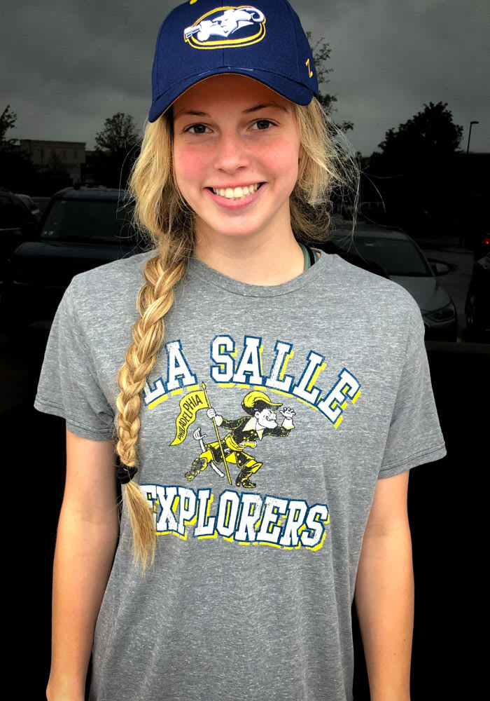 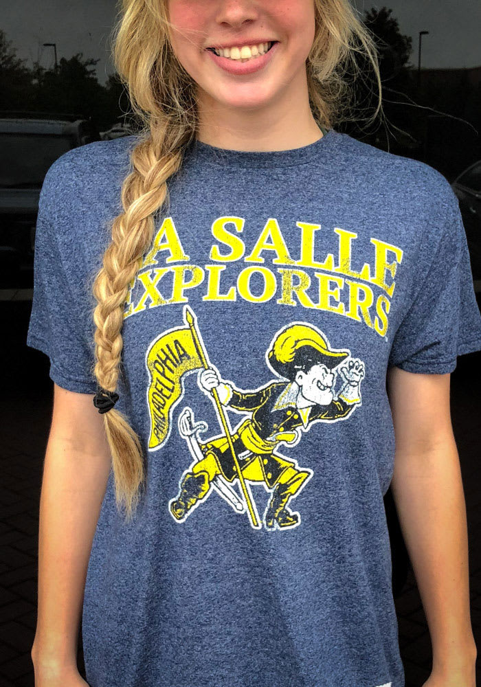 |
|
|
|
Post by golasalle on Aug 31, 2022 13:11:38 GMT -5
Am I the only one who’s not into the L logo? It’s just absurdly large in almost all uses and makes everything seem off-center. I was happy when it was coming back, but have never been enamored with the final product. Still exciting to have a crack at the Adidas stuff 😊 Yeah I am with you. I actually didn’t understand the move and when or why it was made. You can always quibble on logos but I thought the explorer logo from the last decade and change was completely fine and more consistent with it today’s Division 1 school logos. This logo is like an Ivy League or high-end D3 school that just uses the letter because they can Do you mean famous Ivy and high-end D3 schools such as these?     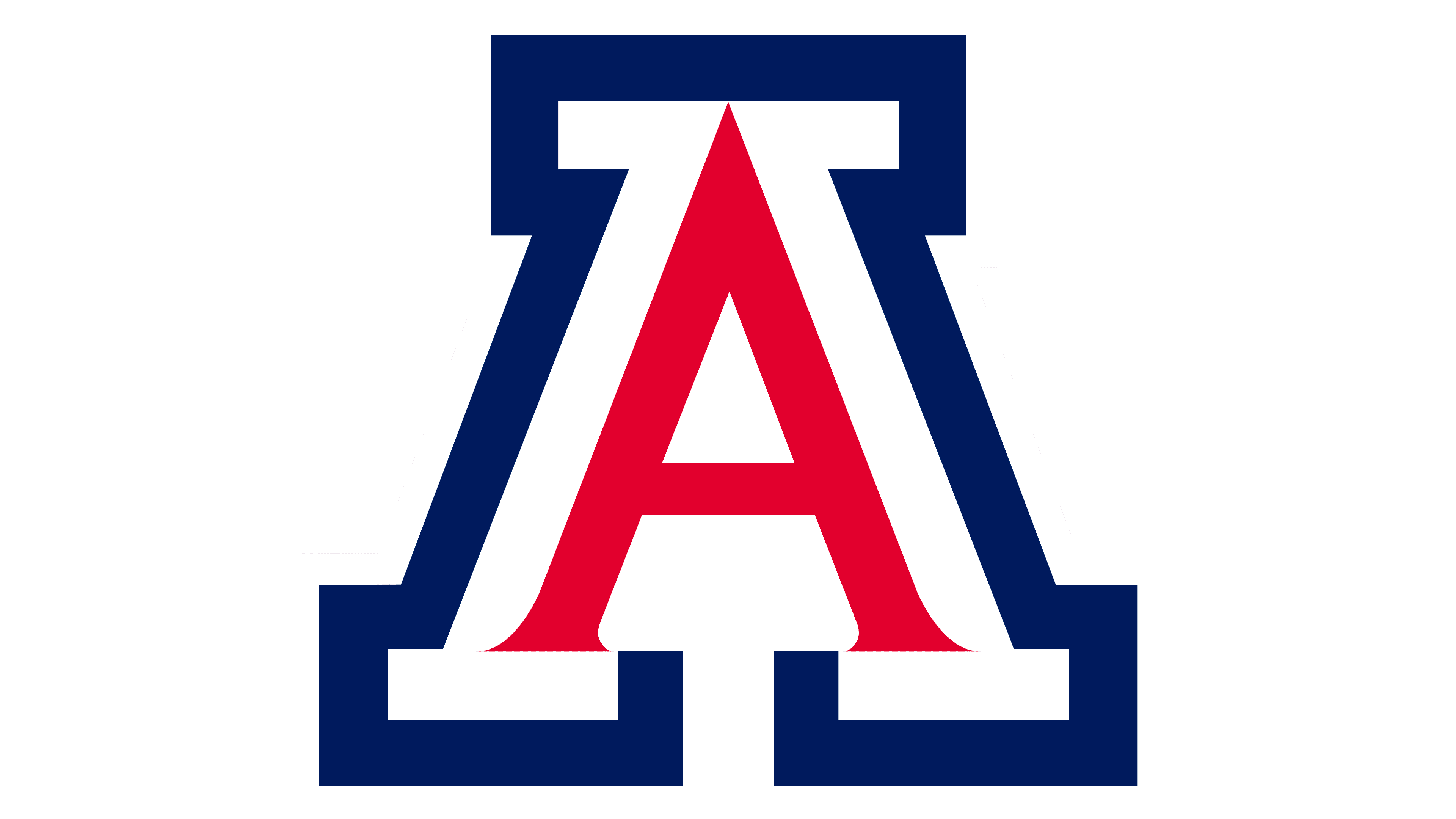 |
|
|
|
Post by walkon on Sept 1, 2022 4:37:16 GMT -5
  Should lean into this one and move to a person as the mascot and not the costume. I'd change the PHILADELPHIA on the banner to "BROAD/OLNEY" or "NORTH PHILLY" tho. rally house sells two shirts with this image on it. i would love the school to use this as well.   I have them both. Unfortunately, they are sold out and only have I think one size now. Best logo in my opinion. |
|
|
|
Post by 23won on Sept 1, 2022 6:39:35 GMT -5
Not a fan of the logo.
|
|
wistergym
Utility Bench Player
  
Posts: 140
Likes: 111
|
Post by wistergym on Sept 1, 2022 14:33:25 GMT -5
Love the Big L. Serious, understated, timeless. Gravitas. Mascot based logos grow stale very quickly. (who remembers the Astronaut outfit?)
|
|